An experimental study on crafting letterforms with physical materials.
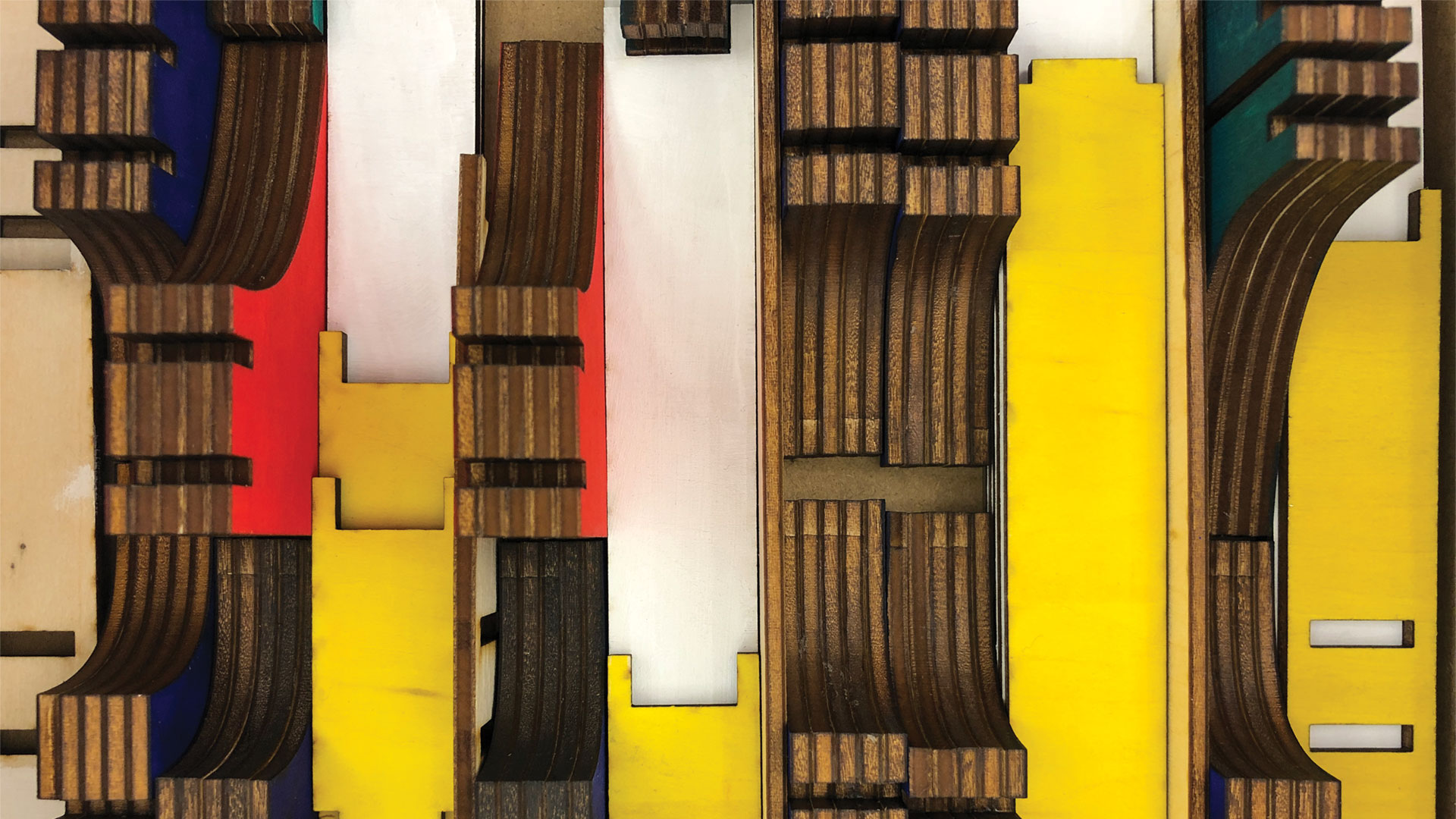
Interacting with physical and tangible letterforms can allow for more visual sensitivity and appreciation to their construction and shapes.
Letters are taken for granted. The topic of type design might seem insignificant to those outside of the graphic design discipline, but their significance is evident throughout our daily lives.
When it comes to type, not many people realize someone’s hands are behind the construction of the letterforms. In the past, type design was a special trade that belonged to punchcutters who dedicated years of their lives to mastering. They completed lengthy apprenticeships and would go on to either develop their own cuts or emulate others that were popular at the time. Developing a single font was a time-consuming commitment that would have roughly taken a decade to complete. Today, new typefaces are born nearly every day as the tools used to make them have been democratized.
With so many fonts and variations of a single letter, it’s no wonder our sensitivity to the letterform as decreased. When we read, we typically don’t think twice about how the text appears and the feelings they are conveying. Our focus is usually on the message at hand, rather than the letters that make them. Type exists all around us, but the development of technologies has further distanced ourselves from our typographic awareness.
To become more visually sensitive to type and letterforms, we must shift our focus away from how type is typically created now, back towards the physicality of the world.
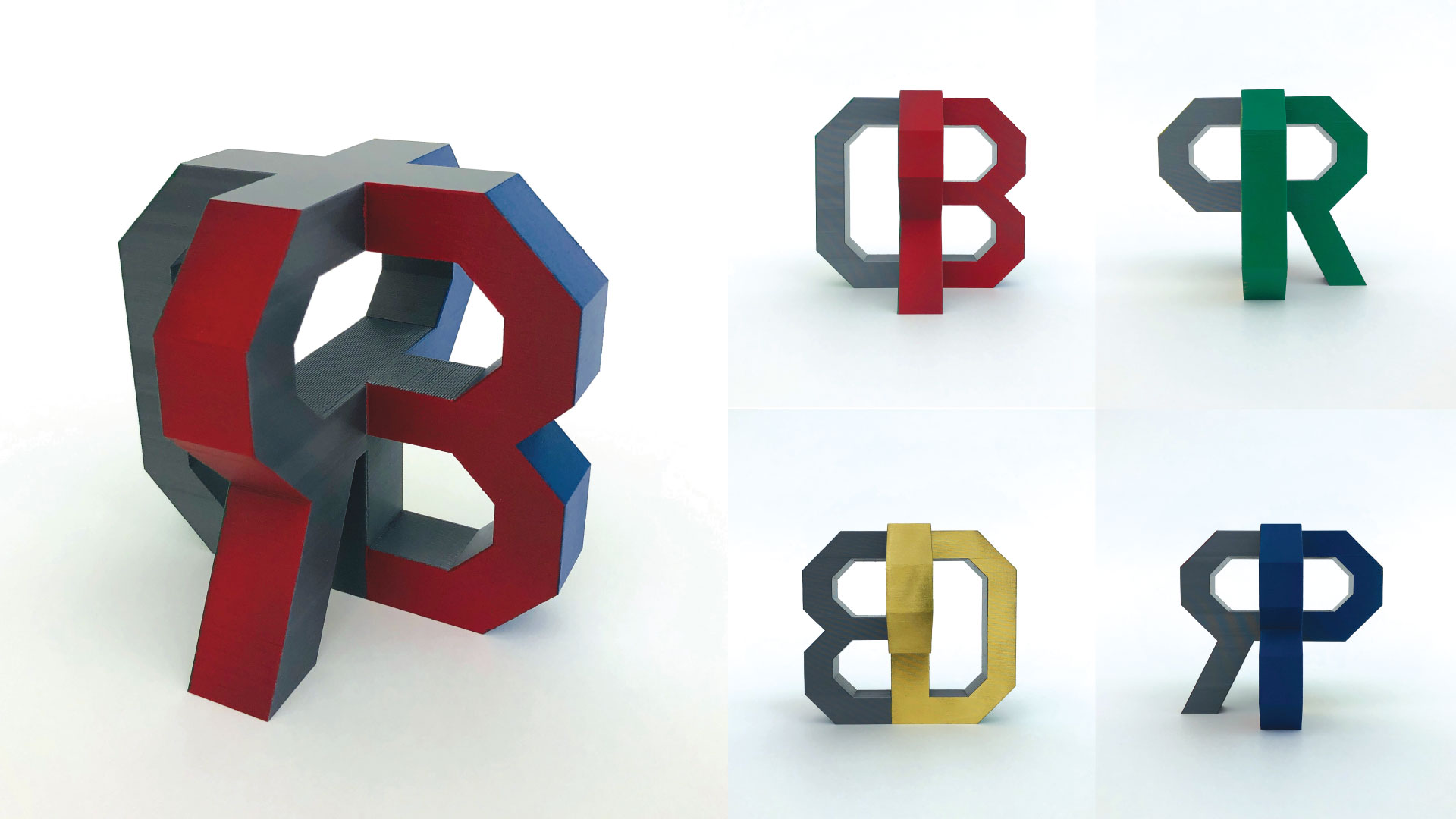
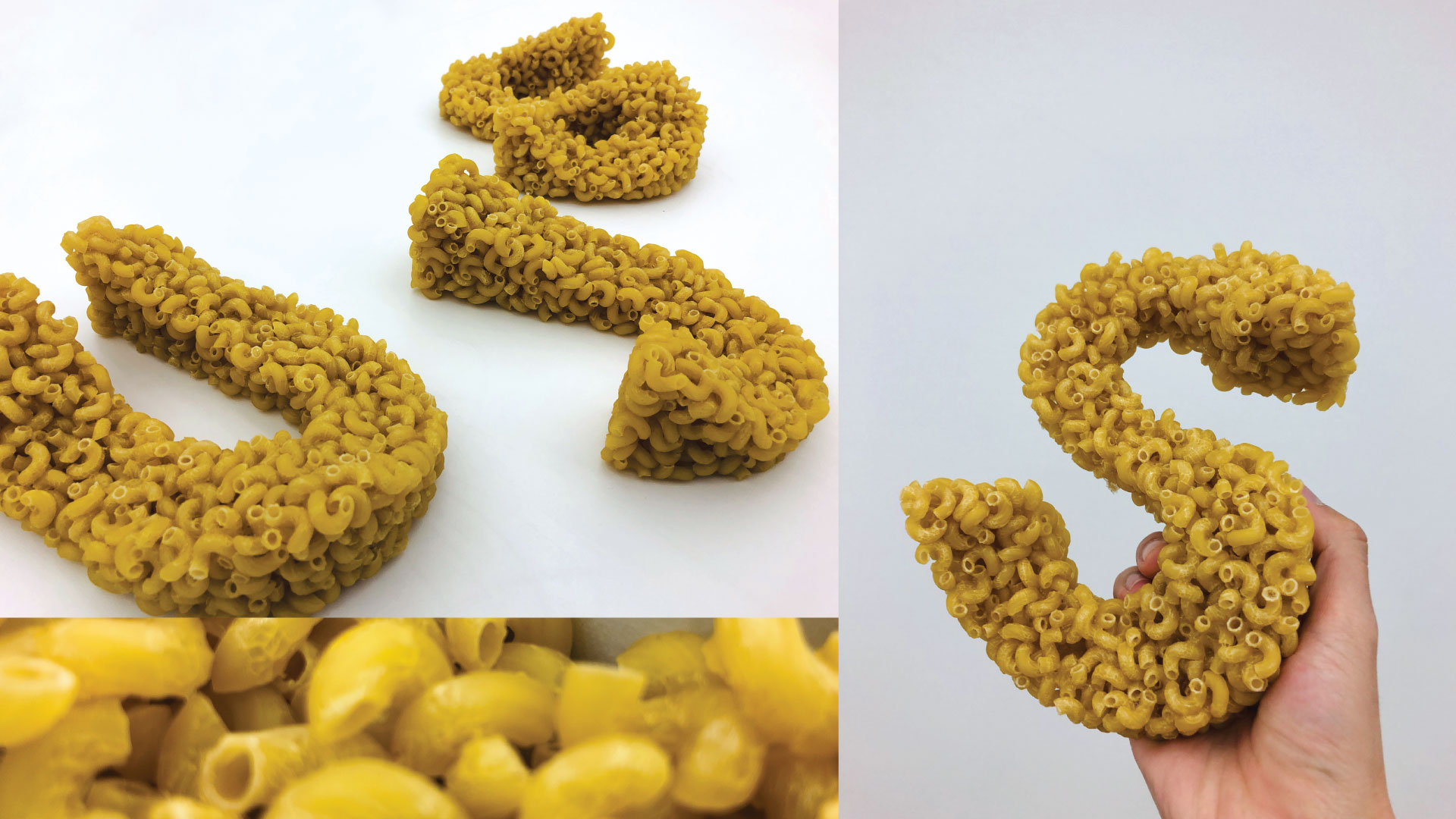
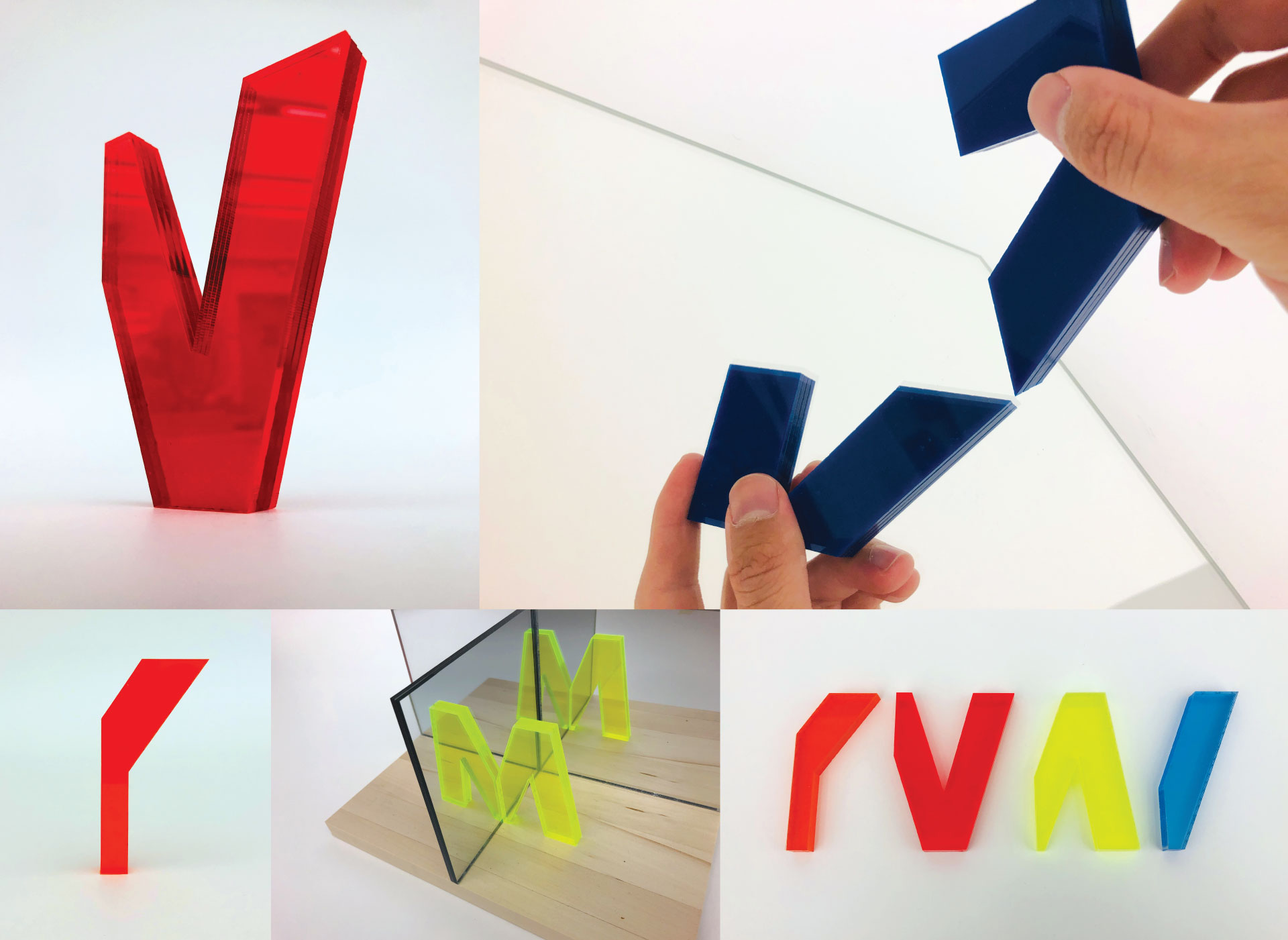
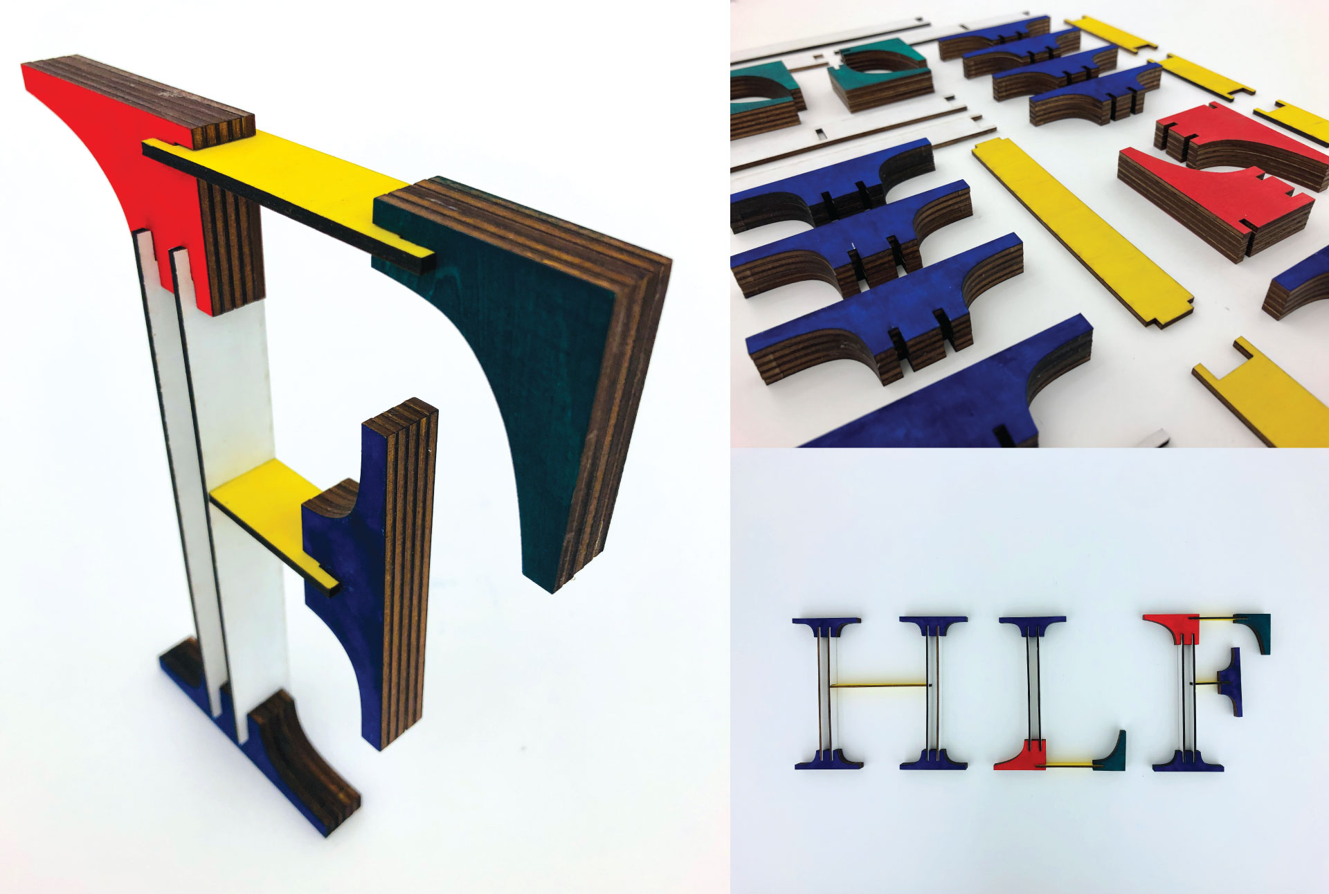
Physical 3D letterforms separated into groups based on the characteristics of their features, each emphasizing different aspects of their form.
Designer
Brandon Huynh

Chang Kim—Primary Advisor
Graphic Design Professor, SJSU
Connie Hwang—Secondary Advisor
Graphic Design Professor, SJSU
Chad Johnson—Tertiary Advisor
Studio Director / Resident Instructor,
San Francisco Center for the Book